Gallius
— Gig (B/W)
Poster ✓
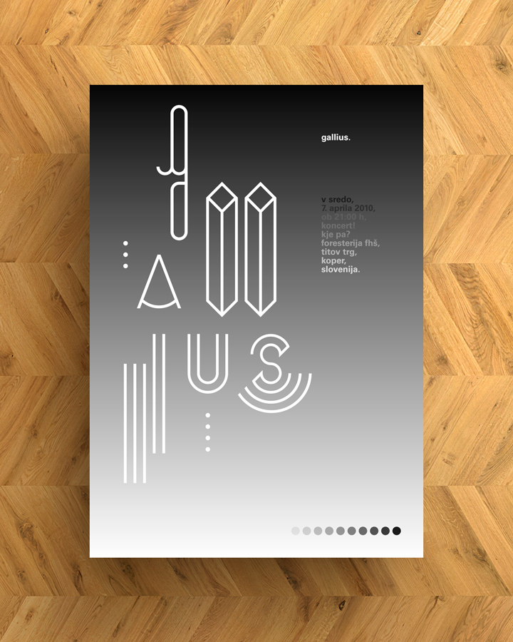
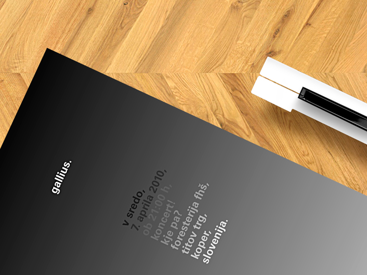
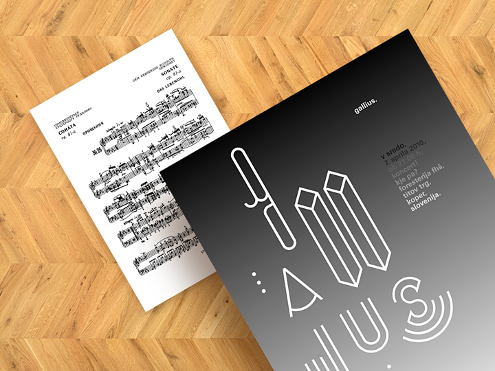
Gallius is an acoustic alternative music project lead by slovene songwriter Marko Galič. Lead by the idea of explore and decode the essentiality of music, he asked me to design a conceptual poster for his experimental concert at Foresterija FHŠ in Koper (Slovenia). To interpret the pure conceptual approach of the artist with music I decided to design an aesthetically essential and clean poster that portrays in seven symbols the pith of music, as seen by the Gallius project. Printed in process black color only ― with a nuance going from black to white ― representing the countless shades of the musical language. On this palette there are seven symbols, just like the musical notes. Used as letterforms, they simply compose typographically the project name. So, briefly: music synthesized in seven symbols.
01
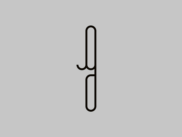
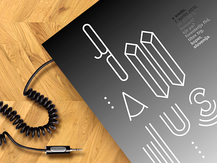
Letter G = audio cables
A cable transmits played music to amplifiers creating sound. A musician transmits feelings to the audience, filtering it, creating emotions.
02
Letter A = metronome
Ticks representing a fixed, regular aural pulse. Mechansm in music. Regularity.


03
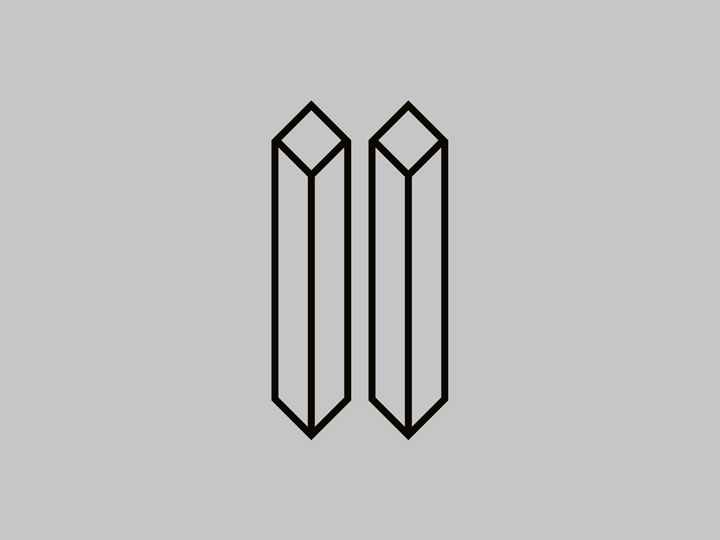
Letters L+L = piano keys
Two symmetric sticks representing duality and harmony.
04
Letter I = music staff
A set of five horizontal lines and four spaces that each represent a different musical pitch. Diversity.


05
Letter U = the tuning fork
An acoustic resonator. It resonates at a specific constant pitch when set vibrating by striking it against a surface or with an object. Representing constancy.


06
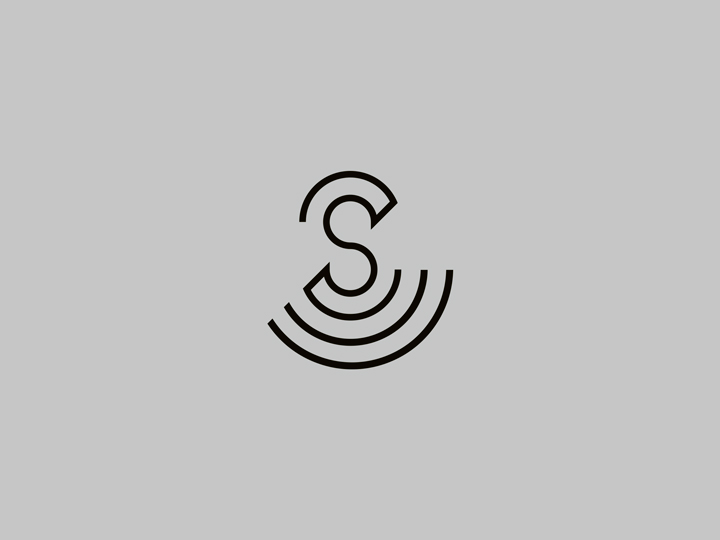
Letter S = a speaker
Let’s get it loud with some audio speakers! Raise up your voice and spread messages through music and its vibrations.

07
Seven musical notes
In addition to the lettering of the name Gallius there are seven dots distribuited in the poster layout. Seven like the musical notes of the diatonic scale.

Notes
This is the third of a three-pieces series of promotional designs conceptually and graphically focused on the theme of ‘color mode’ made for Gallius. This third — presented here above — is a poster based on the Black and White processing. You can complete the overview of the trilogy by clicking here to see the first set of posters + flyers (based on the RGB color model) and by clicking here to discover the second step of the saga (based on the CMYK color model).
Credits
Creative direction → Aleš Brce
Art direction → Aleš Brce
Graphic design → Aleš Brce
Year → 2010